Design Intermission
Generative Design Pitfall
While working on this book I realized how I was easily satisfied with the visual output of the sketches I created. I tried to observe why this happens. And I think it comes down to being satisfied with the code itself working. A critical examination of the visual output is skipped, to jump right into the next coding adventure.
While this speaks volumes on how rewarding coding can be, it also is means we need to learn to explicitly take a step back from coding and evaluate our designs.
Thus this chapter serves two purposes:
-
Give inspiration on elements you can explore in your designs
-
Give a short reminder on basic principles of good design
To do this we will explore design principles and elements. Thus you can come back to this chapter later and evaluate your sketches or find inspiration on how to improve upon the visual output.
At the end I will link you to some books and resources I find to be useful to explore in this context.
On Design
Our aim in designing these sketches is to create good and pleasing compositions. In contrast to programming the rules in design are less hard. Yet, people tried to find universally applicable concepts to talk about design and find “rules” which help in creating good and visually pleasing designs. The naming of these can be different depending on who you ask, but they often come down to one core. These are often split into two groups: Principles of design and elements of design.
The principles of design typically include:
-
Balance
-
Contrast
-
Emphasis / Hierarchy
-
Patterns / Structures / Relation / Rythm
-
Unity
-
Movement
These “principles” are found in every sketch we create. If you list them up like this, it seems like they are separate entities you could work with. They aren’t. They are very tightly connected to one another! E.g. you can’t emphasize an element in a composition if there is no contrast.
These are a great reference to check your designs against and see how changing these can affect outcome of your designs.
The elements of design typically include:
-
Line
-
Shape
-
Color
-
Value / Brightness
-
Texture
-
Space
-
Form
Most “elements” of design also can’t exist without the other, while others are again inseparable. Color without value or brightness is just plain black. There would be nothing to talk about.
Principles of Design
Balance
Balance is about the weight in your composition. Well balanced compositions feel pleasing. They don’t tilt to one side. Your eyes don’t fixate one a single thing, but are free to travel around the image. For the most part this is what we are aiming for. Yet, you can use an un-balanced image intentionally to create unease and tension.
The simplest form balance is static balance: Perfect Symmetry.
There is no feeling of direction or leaning in any way. All is the same. But we can have symmetry in many ways. In the axis but also in shape. Circles e.g. are a perfectly symmetrical shapes.
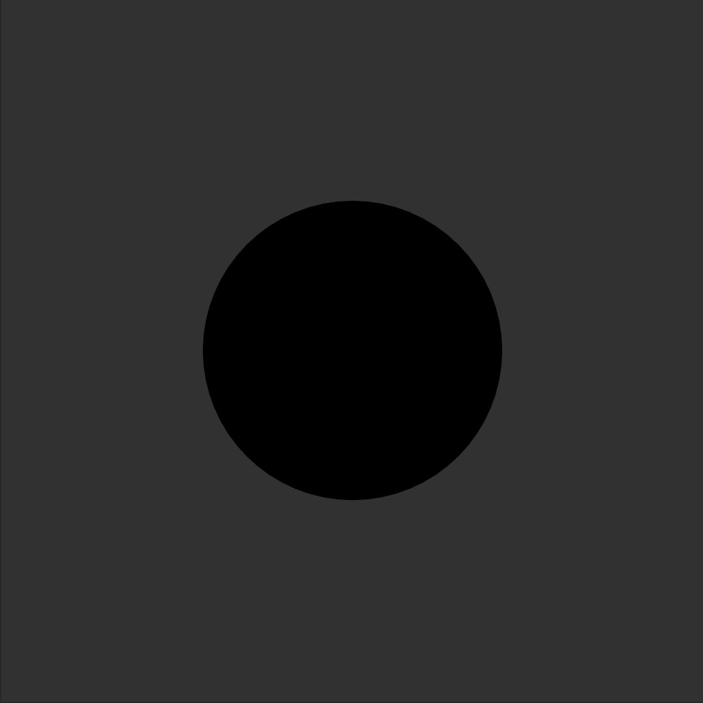
Perfect in a sphere
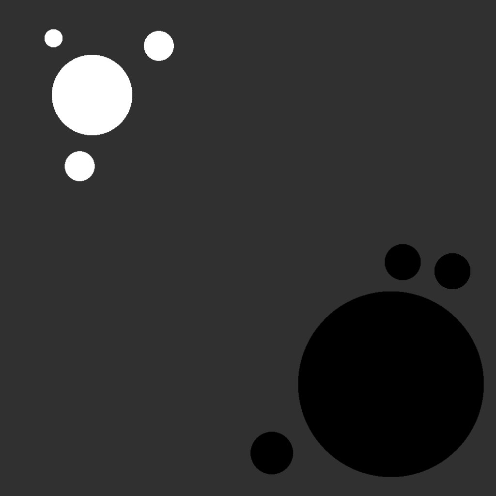
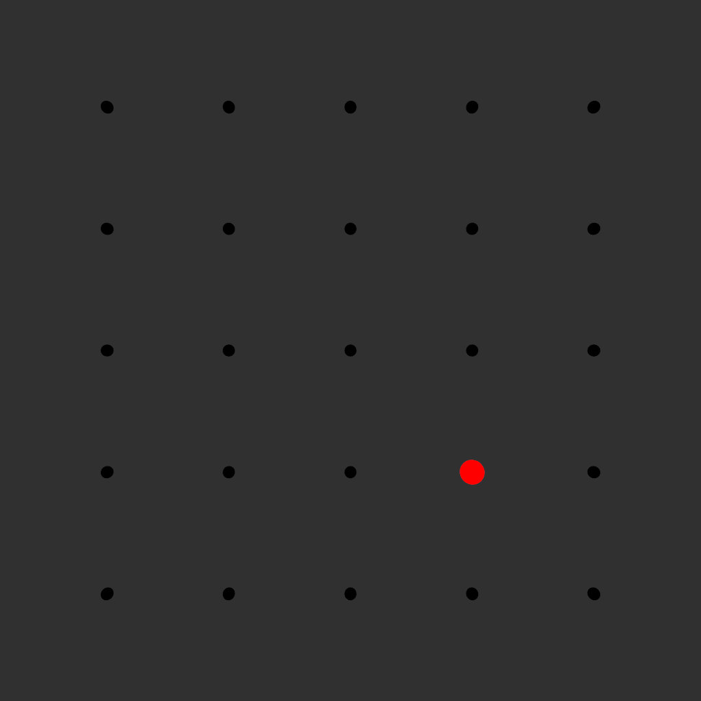
We can also loose balance. Once one part of an image gets to much or too little weight we loose the balance in the image. In the following example all weight is in the lower right. The smaller element in the upper left isn’t enough to balance the image.

Weight to one side
Balance is not only affected by the pure positioning of elements in the frame, but also by their brightness, color, size and texture. Anything that affects how attention-seeiking they are, affects their weight.
Symmetry in Composition, yet the weight is still on the right
Details also play an important role in Balance. Small scale details add to the visual weight of things. Putting to much detail all over your composition will make if feel overwhelming and your eyes can’t find a place to rest.
Contrast
Contrast appears when two elements are different from each other. Contrast can be weak and strong in an image. Strong contrasts are great to grab the attention of the audience, but can fatigue the viewer.
Contrast exists in many forms: Size, Brightness, Saturation, Hue and Form. But also in things like order and texture. Let’s go over some examples.
Contrast in size can give importance to one of the elements but it often also serves the purpose of giving context to elements. Images that lack scale often don’t give a meaningful reference point to viewers.
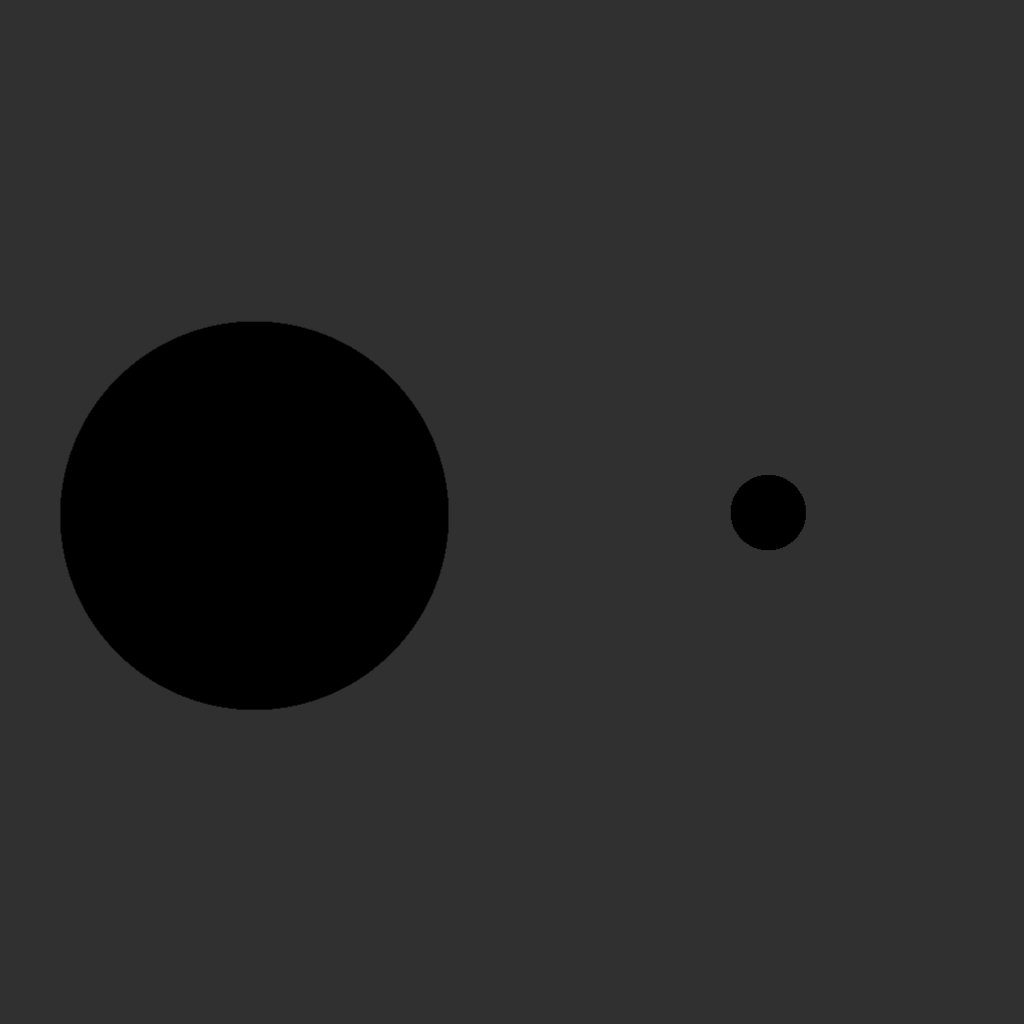
Contrast in Size
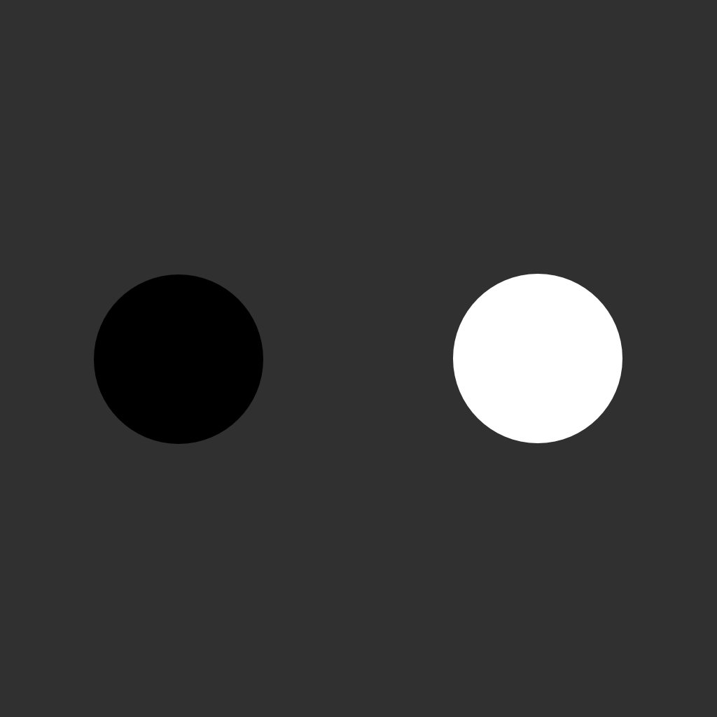
Contrast in brightness can be very strong and will become even more important with the more widespread adaption of HDR in display technology. Bright elements in an image draw more attention of the viewer than darker elements. Though dark element on overwhelmingly bright elements will pop as well.
Contrast in Saturation, Brightness more or less equal
Different Colors have a different potential to contrast. While “yellow” is the brightest color we can perceive, red is still the color that pops out the harshest. But this also affected by the cultural meaning of a color. In western society we link red to danger and alarm. Blue on the other hand for one is the darkest of colors.
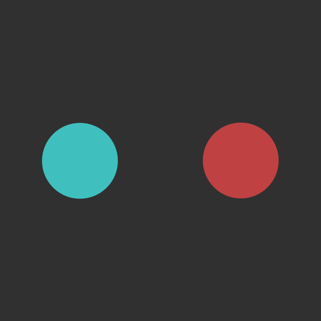
Contrast in Hue, brightness reduced in each cube
This of course plays together with saturation. One very saturated color will stand out against less saturated colors.
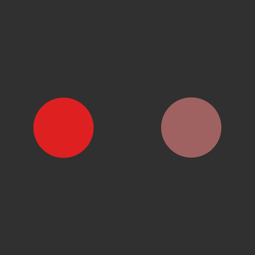
Contrast in Saturation, Brightness more or less equal
Forms and shapes can also create contrast. Spherical or blob like shapes are often perceived as very soft and smooth. Triangular shapes in contrast are spiky and harsh. More rectangular shapes are likely perceived as sturdy and robust.
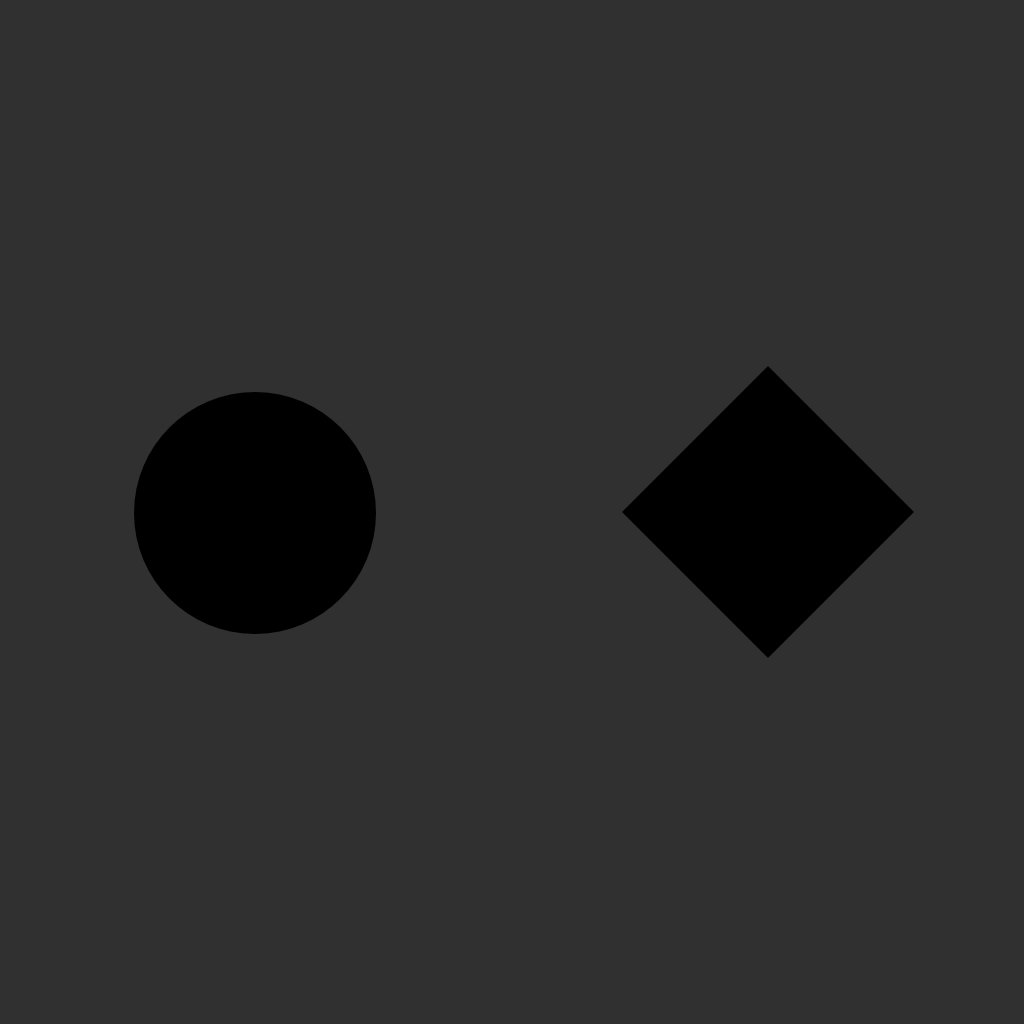
Contrast in Saturation, Brightness more or less equal
The ordering of things can also create contrast. Things that follow perfect symmetrical order can be held against chaotic and random placement.
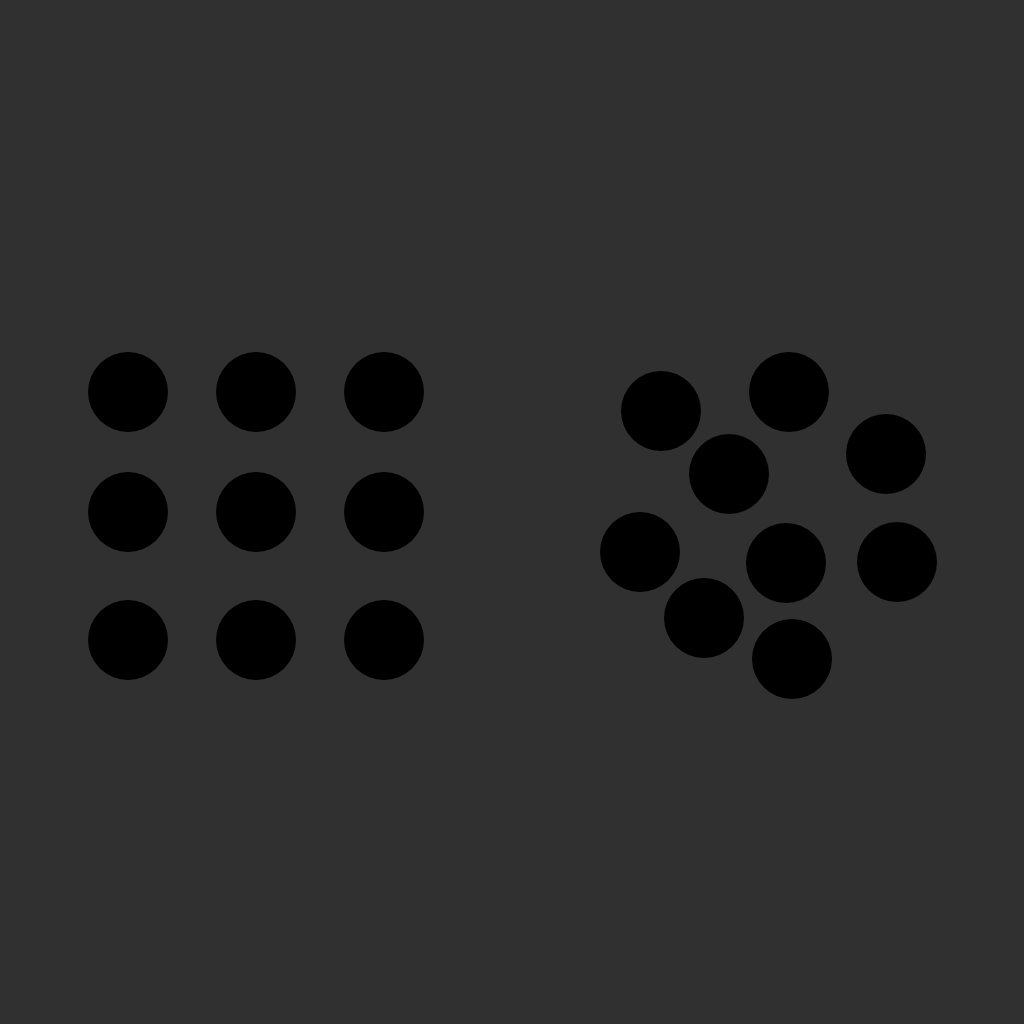
Contrast in Saturation, Brightness more or less equal
As you can see there are many ways to create contrast in your designs and there of course are even more. Essentially you can use any aspect to create contrast. Once you start creating more complex things all of these elements come together.
Emphasis and Hierarchy
Emphasis and Hierarchy go hand in hand with contrast. They define which elements are important in your sketch and which are less so. Newspapers e.g. use contrast in scale and font weight to define their headlines.
Emphasis through size, color and value
Balance in a composition can also have an effect on the focal point of a composition and thus the emphasis.
Emphasis through composition
Without emphasis compositions lack focus and elements to draw the viewer in.
Structures, Patterns, Grids
As humans we love to order and group things. Thus we tend to search for patterns and and structures in images. There are several kinds of patterns and relations we tend to pick up.
The most obvious is grouping by proximity.
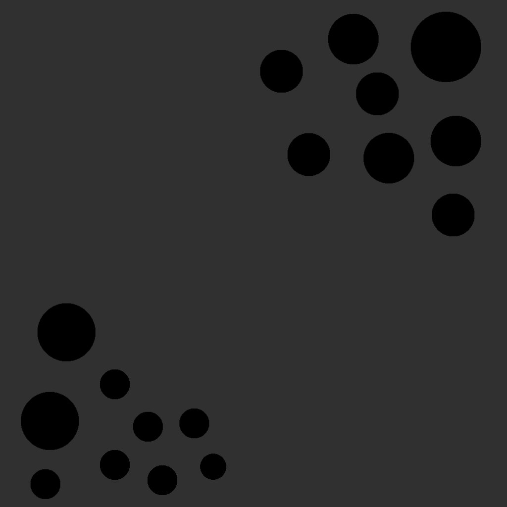
Relation through proximity
In a structurally chaotic group we will pick up other design elements like color, shape or texture to order things. Here we see a group of black and a group of white circles.
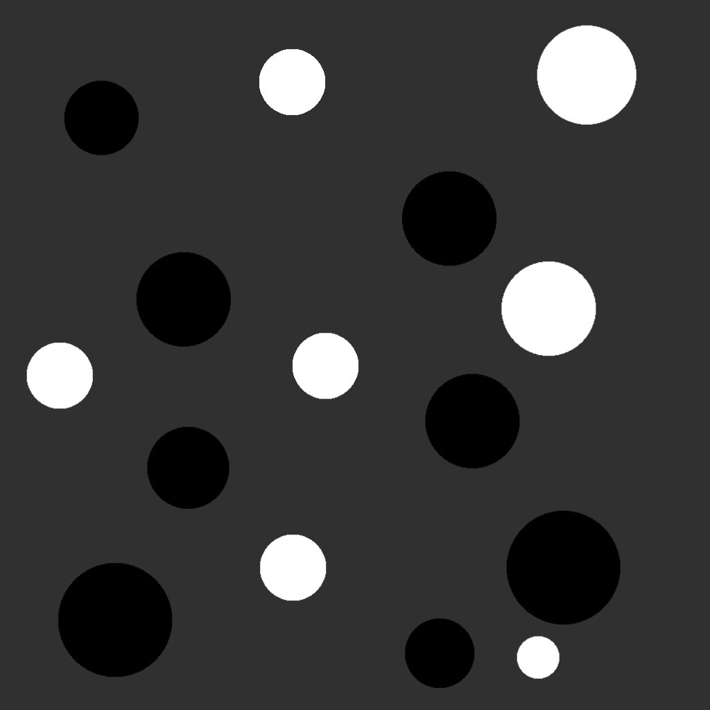
Relation brightness
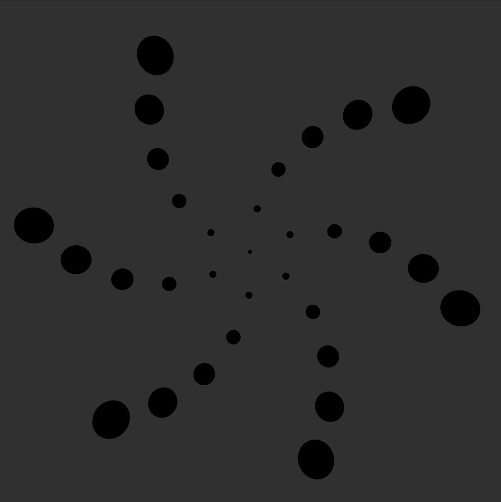
Movement
Movement can be easily confused with motion. But we mean different things when talking about these. Movement refers to the way the eyes travel through your composition. Is there something to lead the way. In the simple sketch above you can see movement in action. Our eyes follows the invisibles lines toward the center created by the circles.
You can use Movement to guide the viewers attention toward the important elements in your designs
Emphasis through composition
Unity
Unity is the last of the principles and it is about all other principles coming together. You can have compositions which are strong in Movement, yet lack the necessary balance. Or you have perfect balance, but there really is not much movement going on inside the frame. If you are iterating over an idea and have to pick a final sketch, Unity is the decider.
Elements of Design
Line
Lines are essential to design. Almost every design starts with a line. And if you have been sketching out the ideas before you went into code, you have been using lines as well. Lines come in many different variations: short, long, thin, thick, straight and curvy. Lines can be very expressive in their tone or very strict and mathematical.
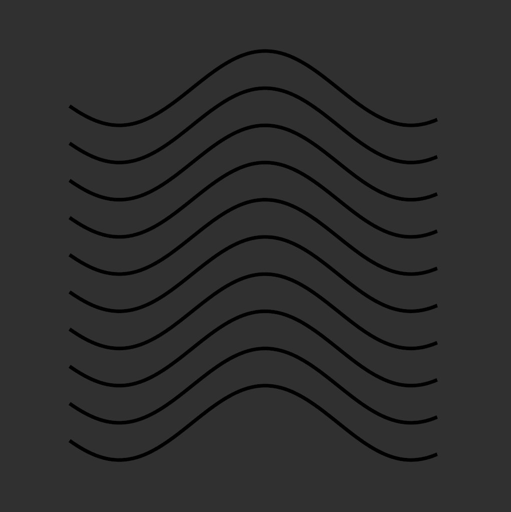
Curvy Lines
The Line Renderer
But if lines are so important, why haven’t we used them thus far?
Lines aren’t that easy to draw in three dimensional space. The only things visible to the renderer are polygons and the consist of quads and triangles. Thus, if you want to render nice curvy lines you have to draw a lot of polygons. Things get even more more complicated if you want to draw these in three dimensions, as you also have to make sure all polygons are facing the camera. Luckily, Unity supplies us with a component that takes care of this! To get you started you can try this script:
Here we will create an array of GameObjects. We need these to add our LineRenderers to. Next we set a bunch of settings on these. LineWidth and Color for example.
In Update we have two nested for Loops. We iterate over the LineRenderers and calculate an Array of Positions for each of the LineRenderers. Using SetPositions() we apply these positions to the LineRenderers.
Shape and Form
Another way to expand your possibilities with sketches is to grab different shapes. You can either look at the various basic 3D shapes Unity offers out of the box or you can bring in your own. Shapes frequently used in generative design include triangles and hexagons.
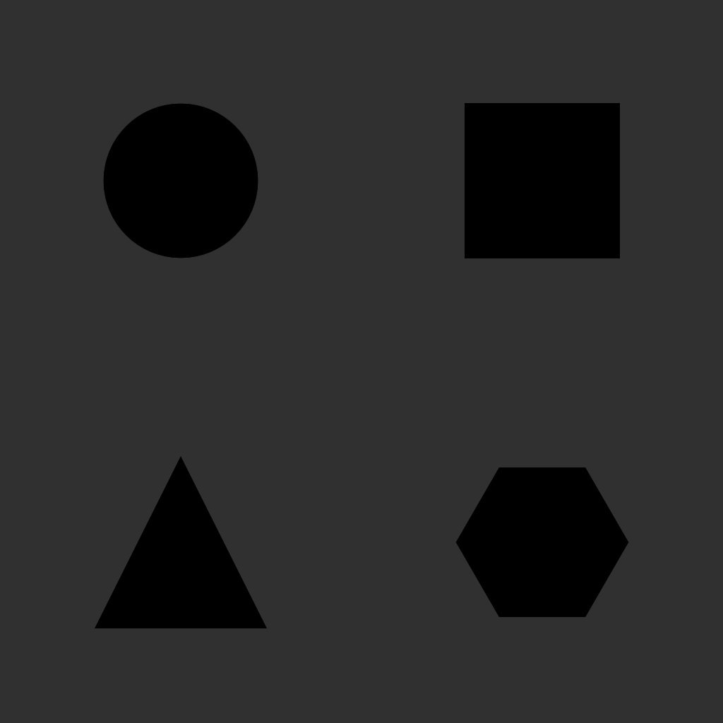
Shapes
Circles and spheres are also in high demand, due to their visual appeal.
You can also look into using the 3D counterparts of shapes: Forms. Converting the square to a cube, the circle to a sphere and triangles to pyramids will open up new possibilities. But for this to happen you will need to use materials which will actually use lights. Unlist shaders as we used so often won’t work, as the depth will now show without shading.
We will go deeper into this in the chapters on light and textures.
Color & Value
I personally think color is the hardest thing to master as a designer. Slight shifts in color can have such an impact on the feeling of an image. But not only is it hard to master color in itself. Color is also the one thing that is relative. If you frame your image in 16 by 9 everything stays relative to that frame size. No matter what.
Color though changes. Color is extremely dependent on the viewing conditions. Different monitor? Different Colors. Rendering to Video? Different Colors. Going into print? Different colors. Changing the light in the room around you? Different colors as well, as your eyes adjust to the environment around you. So many things affect color and how we perceive it!
But don’t be afraid, because color also is a lot of fun! It is the thing which most heavily affects the feeling of your scene.
So what can color do for you?
Color can create moods and feelings in the viewer. While meanings of colors can vary across cultures you can assume certain meanings inside your own cultural sphere. Pixar for example used these meanings of colors prominently in their movie “Inside Out”. Anger is presented as red, Sadness as blue, Disgust as green, Fear as purple and Joy essentially yellow.
You can work with these implicated meanings and it’s important to be aware of these meanings, yet there is more to color.
As Color is such a big topic it has been analyzed and formalized for some time now. Sir Isaac Newton wrote about it as well as Johann Wolfgang von Goethe. As we established in the first chapter the teachers at the Bauhaus also worked hard on studying color. Namely Johannes Itten, Wassiliy Kandinsky and Josef Albers. Some of the concepts they uncovered are still very relevant today.
The color wheel
We use the color wheel to display the relationship of colors and we also established it as one convenient way to pick colors inside creative applications. It is a great way to visualize the relationship between colors.
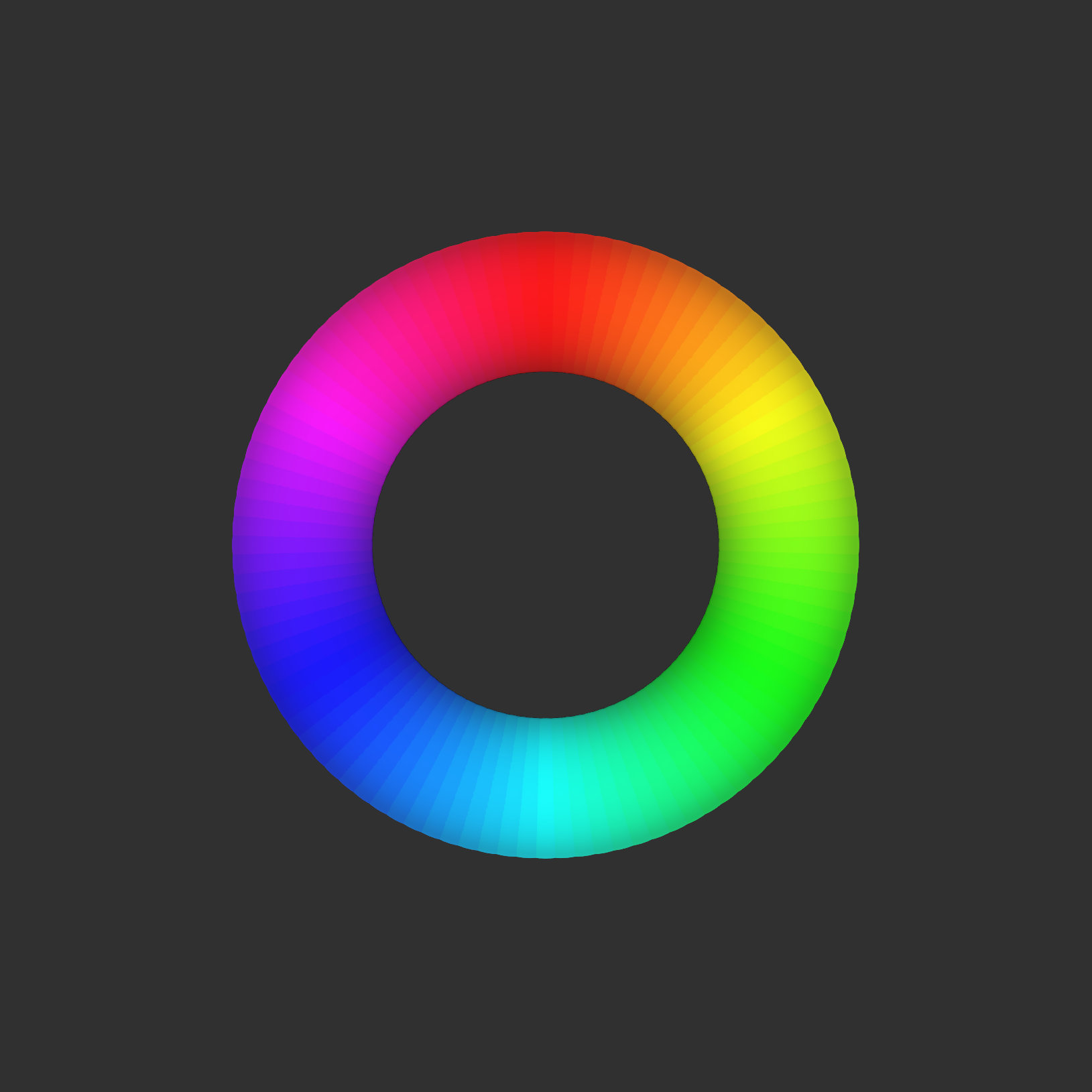
Color Wheel
We can use these relation ships to create color palettes:
Analogous colors are relatively close to one another on the color wheel. They often harmonize well with one another.
Complementary Colors lie directly opposite to one another on the color wheel. They contrast each other very harshly.
Triadic color schemes are based on three colors equally spread across the color wheel. The results are very colorful and often feel very intense.
For pretty much all our sketches so far we have been using a very neutral dark gray background. But the whole experience changes if you change the background of a sketch. This is also a great way to experiment with colors!

Multiple Cubes Shifting
Textures
Textures can also be interesting to explore. Textures can give a haptic feeling to your sketches that otherwise do not exist in the digital world. We will look at more complex texture setups in a later chapter. But for now you could explore using simple textures to add something unique to your sketches.
Anything can create a texture. Enough lines close to one another will at some point become texture. The same goes for any other shape. Even text becomes a mere texture if viewed from enough distance.
The code for the following examples is exactly the same, yet the result is something completely different due to the use of a flower texture which also uses an alpha channel.
Space
Space, often referred to as negative space, is the area in between objects. Negative space has an influence on how a compositions feels. Airily or tightly packed. It also affects how we perceive patterns and structures. Finding a good balance between positive and negative space will help your design feel more significant.
Recommendations
Here I just want to recommend you some books and video courses I enjoyed and learned lot from. This is a very subjective selection so feel free to search the web for alternatives.
Interaction of Color - Josef Albers
Graphic Design The New Basics - Ellen Lupton, Jennifer Cole
Bildsprache - Christan Leborg
The Animator’s Survival Kit - Richard Williams